
Adam Mickiewicz Institute Refreshes Its Visual Language. New Visual Identity for IAM and Culture.pl
The Adam Mickiewicz Institute presents a refreshed visual identity for IAM and a new visual system for Culture.pl. The change reflects the way the Institute shares Polish culture with audiences around the world today – across borders, partnerships and a growing range of platforms – while preserving the recognisable character of a brand shaped over more than 25 years. The new identity brings greater coherence to the Institute’s visual language, creating a shared framework for IAM and Culture.pl while allowing each to retain its distinct voice. It was developed in close collaboration with the IAM and Culture.pl editorial teams and designed by Podpunkt studio.
The new IAM identity responds to the changing ways in which cultural communication – and, consequently, the Institute itself – operates today. Video, animation, social media and digital formats are playing an increasingly important role, while materials are produced simultaneously for different channels, markets and partners. What was needed, therefore, was a system that works effectively not only in print and static materials, but also in motion, on screen and across multiple languages.
The change also brings greater clarity to the relationship between the Institute’s two brands. IAM communicates the institution’s activities, projects and international partnerships. Culture.pl remains a medium addressed directly to audiences – a place for stories about Polish culture. The new visual system highlights their shared origins without blurring the distinction between their respective roles.
“IAM is more than 25 years old. Over this time, we have built very strong relationships with institutions around the world and with the cultural community in Poland and abroad. This experience is the foundation of who we are. At the same time, the way international cultural institutions communicate today has changed significantly. We needed a system that reflects the way we work – across many countries, channels and formats – and enables us to talk about our activities in a contemporary, clear and consistent way,” says Olga Wysocka, director of the Adam Mickiewicz Institute.
The system has been designed to accompany a wide range of projects – from exhibitions and performances to music, film, literature and interdisciplinary projects – without imposing a single aesthetic on them.
“Our role is to identify valuable phenomena, connect people and institutions, and create conditions for Polish artists to be present internationally. That is why we want the IAM brand to be recognisable, while at the same time giving creators and their work room to speak for themselves. The IAM mark should be a clear signal of quality – an indication that a project is backed by knowledge, experience and strong international partnerships. We apply the same principle to the visual identity,” says Olga Brzezińska, deputy director of the Adam Mickiewicz Institute.
IAM: A Recognisable Mark, a Complete System
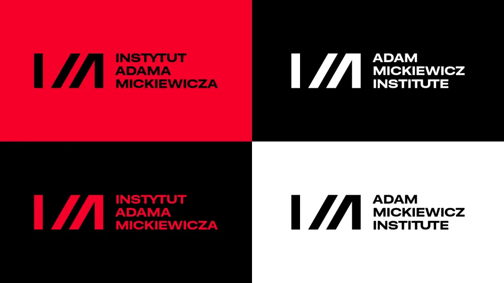
One of the key principles of the project was to preserve the recognisable IAM mark. Its form has been subtly refined and adapted, among other things, to work across different scales and digital formats. Red has also been retained as one of the brand’s primary colours, in a new shade.
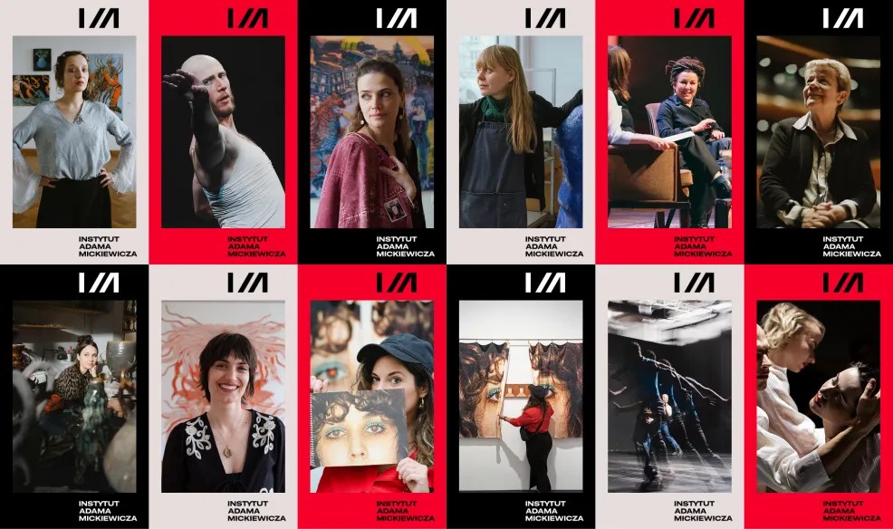
The biggest change has taken place around the mark itself. A comprehensive system has been created, encompassing typography, colour, composition, digital and printed materials, as well as principles governing the brand in motion. It is designed to enable consistent IAM communication regardless of the field, country, format or project partner.
One of the fundamental elements of the new visual language is the slash present in the IAM mark, which in the new system extends beyond the logotype: it crops images, structures compositions, creates transitions and serves as an important element of the identity in motion.
Motion design was one of the key areas of the project from the very beginning. The IAM mark no longer needs to appear solely as a static logo – it can open and close video materials, create transitions and provide a recognisable visual framework for videos, reels and other digital formats.
“What was most important to us was translating IAM’s recognisable elements into a complete identity system that responds to today’s modes of communication. The mark itself has changed very subtly, while a visual language has been built around it that can work both in print and in digital environments and motion. Collaboration with the IAM team was also very important – the identity is not only an image projected externally, but also a tool that people within the institution use every day,” says Magda Dobruk, co-lead of Podpunkt Graphic Studio.
Culture.pl: Shared DNA, Its Own Character
A new iteration of Culture.pl has also been developed on the basis of the system created for IAM. Culture.pl is a medium dedicated to Polish culture and run by the Institute, and this year it celebrates its 25th anniversary.
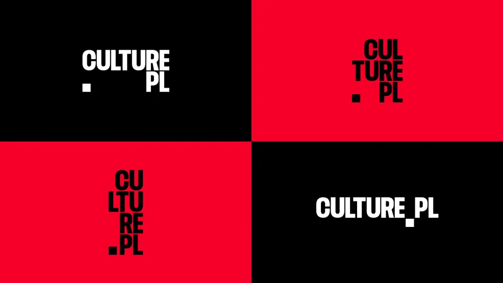
IAM and Culture.pl have different roles and communicate with different audiences. IAM builds partnerships, initiates and supports international projects, and works with artists and institutions. Culture.pl addresses a broad audience in Poland and around the world, telling stories about Polish culture through articles, video content, podcasts and social media.
That is why the two brands have their own languages and personalities, while remaining visually connected.
“At IAM, the starting point was the slash – an element that had already been part of the mark, but has now become the foundation of the entire visual language. It is strongly connected to our digital language: it can be found in a web address, it leads further to subsequent content. For us, it became a symbol of movement, transition and opening up new paths. When creating the Culture.pl identity, we wanted to preserve this shared DNA while giving the brand its own personality. That is why, alongside the slash, there is a distinctive dot, which can function as a frame or window opening access to further cultural content. Both brands belong to the same world, but each speaks in its own voice,” says Emilka Bojańczyk, creative director at Podpunkt Graphic Studio.
In the case of Culture.pl, the change is more pronounced. The dot has become a distinctive element of the system, used as a frame, a window onto content and an element of animation. The identity has been designed with the various formats used by the editorial team today in mind – from the website to YouTube, podcasts and social media.
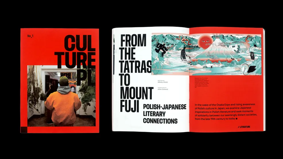
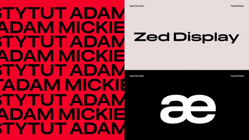
Typography is also an important element of both systems. The ZED typeface, developed by an international team of designers at Typotheque under the creative direction of Peter Biľak, was selected with readability, accessibility and communication across multiple languages and alphabets in mind. It is intended to build brand recognition while working effectively across a wide range of scales and applications – from websites and social media to publications and printed materials.
A Project Created in Collaboration with the Team
The project was developed by Podpunkt, an award-winning Warsaw-based graphic design studio specialising in brand strategy, visual identity and communication design. Podpunkt’s work has received recognition including at the European Design Awards and Creative Review Annual, and has also been featured in Taschen’s The Elements of Brand Design.
For its visual identity for the National Museum in Kraków, the studio received top honours in prestigious competitions on two sides of the globe – first prize in the American The PRINT Awards, a competition organised by PRINT Magazine, the world’s oldest magazine dedicated to graphic design, as well as the Best Design Award at the Golden Pin Design Award in Taipei.
For the IAM and Culture.pl project, Emilka Bojańczyk, creative director at Podpunkt, was responsible for the creative direction and identity concept, while Magda Dobruk, co-lead of the studio, was responsible for the strategic and workshop process. The identity was developed by the design team: Emilka Bojańczyk, Agnieszka Drozd, Diana Makulska, Ewa Najnigier-Galińska, Oliwia Pietrzyk and Basia Synak, a designer specialising in motion design, who was responsible for developing the identity in motion.
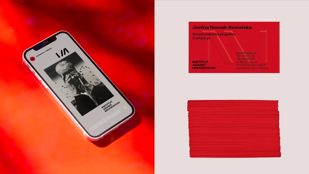
The identity was developed in collaboration between the studio, the Adam Mickiewicz Institute team and the Culture.pl editorial team. Their shared goal was to create a system that, on the one hand, strengthens recognition of both brands and, on the other, serves as a simple and flexible tool for everyday work.
Media contact
Joanna Andruszko
e-mail: [email protected]
+48 693 974 686
The Adam Mickiewicz Institute (IAM) connects Polish culture with people around the world. As a state institution, it builds lasting interest in Polish culture and art, strengthening the presence of Polish artists on the global stage. It initiates innovative projects and supports international cooperation and cultural exchange. It promotes the work of both established and emerging artists, showcasing the diversity and richness of our culture. The Adam Mickiewicz Institute also runs Culture.pl, a comprehensive source of knowledge about Polish culture. More information: www.iam.pl.